A Tale of Two Synagogues
In December 1953, Rabbi Mortimer Cohen led a small delegation from his Conservative synagogue in Philadelphia to meet with Frank Lloyd Wright in his suite at the Plaza Hotel in Manhattan. Wright was in his eighties; he was a celebrity and the greatest architect alive—a fact of which he and the rabbi were both well aware.
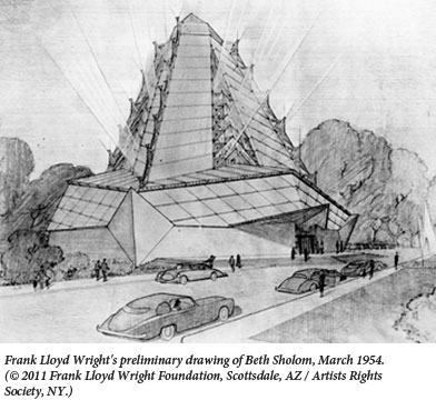
Rabbi Cohen approached Wright with due reverence, and Wright graciously hearkened to him. Cohen wanted a building that looked like a mountain, a kind of “portable Mount Sinai,” brought to suburban Philadelphia. Wright liked the idea. As it happened, he already had the pyramid shape in his repertoire. His drawings for his unbuilt “Steel Cathedral” of the late 1920s foreshadow Beth Sholom.
Rabbi Cohen was a student and follower of Rabbi Mordecai Kaplan, who hoped for the development of a distinctly American Judaism. For his part, Wright preached and practiced a distinctively American architecture. (In fact, he invented and relentlessly promoted the word “Usonian” to mean United States-ian.) When he mailed the preliminary drawings for Beth Sholom to Rabbi Cohen, he described the new synagogue as “truly a religious tribute to the living God. Judaism needs one in America. To do it for you has pleased me . . . Here you have a coherent statement of worship. I hope it pleases you and your people.” (Wright was a genius, but did sometimes sound like a pompous windbag.)
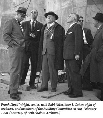
Their correspondence continued through the next five years of design and building, which were also the last five years of Wright’s life. Eventually, Wright came to describe Cohen as the co-designer of the building. “You provided me with the ideas,” Wright wrote generously to Cohen, “and I tried to put them into architectural form.”
In most respects, Cohen got the building he wanted. But as Joseph Siry, a professor of art history and American studies at Wesleyan, tells us in his massive and absorbing new account of the building of Beth Sholom, there was one persistent client desire that Wright never got around to satisfying. Rabbi Cohen’s status as “co-designer” notwithstanding, Wright was famous for his indifference to the architectural preferences of his clients, and he did not give in. Unfortunately, just that feature might have made Wright’s majestic building feel like a synagogue.
Siry shows how the building of Beth Sholom emerged from Wright’s earliest work as a young man at the celebrated architectural firm of Adler and Sullivan. Adler and Sullivan played a central role in the creation of the world’s first steel-framed skyscrapers and did much to give Chicago its distinctively plain-spoken, assertive yet beautifully detailed architectural character.
They also built synagogues. Dankmar Adler was a rabbi’s son who came with his father from Germany as a child in 1854, served in the Union Army during the Civil War, then set up as an architect. Adler’s Isaiah Temple of 1898 was the last building of his career. Siry notes that Wright’s Unitarian Unity Temple in Oak Park, Illinois shows the clear influence of Adler’s last building.
Wright was a visionary on the largest scale, an engineer of native brilliance, a magnificent draftsman, and a complete artist, with a lovely and original color sense, who designed furniture, rugs, lamps, and decorative panels. In fact, if he got his way, every last fabric and fixture and stick of furniture in every last corner of his buildings. To find anything like the sheer productivity of Wright’s imagination, we must search backward till we reach Gian Lorenzo Bernini in the 17th century. Wright is easily the greatest architect in American history and—less easily but (in the end, I think) decisively—the greatest of the prodigious 20th century, greater even than Edwin Lutyens or Louis Kahn, greater than Mies or Corbu or Bunshaft or Barragán at their very best.
Wright’s Beth Sholom rears up like a faceted abstract mountain. It is a soaring pyramid of translucent glass panels set atop a large concrete platform, on which it rests like a pointed hat nearly covering a concrete sailing ship from prow to stern. The congregants sit within this pyramid, in a great hall suffused with light. Daylight enters through the sloping sides. (The building’s sides are ribbed wire glass on the outside, with translucent plastic panels inside.) At night the pyramid glows gold, and spotlights pick out the cast-aluminum ornaments—supposed to recall menorahs—along the seams between the pyramid’s faces. With his incomparable dramatic flair, Wright arranged the entrance so that one walks up a broad, low flight of stairs catching hints of the great space hovering above. At the top you turn around and behold the huge, magnificent room.
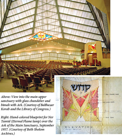
The room holds three large groups of seats, one in the middle that slopes down toward the bimah (the table where the Torah is read) in front and one on each side, where the seats face the bimah from the left and right. It is a handsome room, with the suave elegance of a posh concert hall, plus the incomparably inventive panache that only Wright could bestow.
Wright’s Beth Sholom is a tour de force—as a building, but not as a synagogue. His widow Olgivanna unwittingly explained the problem when she described the great hall. “A soft silver light permeates the whole interior with a meditative quality that asks for peaceful silence.” Her description is just right. Peaceful silence is perfect for a hushed audience preparing to focus its whole attention on the performers onstage. But a synagogue is designed for praise and song and chanted Torah, not silence. The great elegant room has the generic, rootless feeling of so many other monuments of liberal religion in mid-century America.
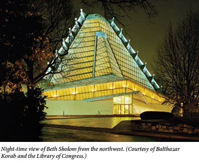
One of Beth Sholom’s most striking features is the remarkable lighting fixture that hangs from the tall ceiling in the great hall. Naturally, Wright designed it himself. Siry describes it as a “triangular light basket or chandelier of translucent sandblasted glass in panels of red, blue, green, and yellow, set in an aluminum frame and lighted mainly from above.” It is one of the most beautiful things Wright ever did. And beneath this chandelier, at the exact center of the great hall beneath the soaring glass pyramid is—nothing.
Rabbi Cohen had imagined a synagogue with an exterior modeled on Mount Sinai and an interior that would have the bimah as its central focus, and yet it was precisely here that Wright refused to follow instructions. Cohen had wanted the Torah to be read, as it used to be in most pre-modern synagogues, “deep in the heart of the congregation,” at the center of Wright’s soaring room and right beneath the dramatic chandelier. In one of his first letters to Wright, Cohen had said, “to place the Bimah in such wise would carry out what I blushingly call ‘my philosophy’ of the interior seating plan of the Synagogue.”
When Wright sent his first design in March 1954, ignoring Cohen’s “philosophy of the interior,” Cohen carefully traced it on tissue paper and indicated where the bimah could be placed:
[It] need not necessarily be rectangular in form. It could very well be made in the form of a triangle to conform with the beautiful variation of triangles in which the main building is composed . . . We could sacrifice the extra 14 seats.
As Siry writes in his meticulous reconstruction of the design process, “Cohen kept after Wright about this issue more than any other.” In 1957, when construction had already been underway for almost a year, he was still working on Wright to implement his idea of the bimah as “a little island set in the midst of the congregation” that was distinct from the pulpit. It would, he wrote Wright “fulfill an old traditional form of the Synagogue which I have long dreamt of restoring, especially in so modern a building as the one you have designed for us.”
Although Wright briefly considered a central bimah made of concrete, nothing ever came of it. Cohen kept telling Wright that a central bimah would “influence Synagogue Architecture for years to come,” but Wright would not be swayed:
Concerning the controversial Bimah! The more I think of so emphatic-emphasis on (or at) the center of the Synagogue, the less I like the reiteration of the chandelier . . . why not let it come along after we see the auditorium all together—you and I?”
In his casual use of the word “auditorium,” Wright showed his failure to understand Cohen. In the end, Cohen was opposed not only by the great architect but by a synagogue board intent on maximizing paid seats. He had to be satisfied with a portable bimah that was sometimes moved to the center.
Cohen’s wasn’t the only voice arguing for a central bimah. In 1954, the synagogue historian Rachel Wischnitzer read about the Beth Sholom project in TIME magazine. She was impressed, and wrote to both Rabbi Cohen and Frank Lloyd Wright that Beth Sholom’s design “was anticipated by those obscure Jewish carpenters in Poland and the Ukraine who built village synagogues on a square plan with stepped pyramidal roofs and the bimah, of course, in the center.” It seems that Cohen himself underscored the resemblance between Wright’s project and these synagogues by showing “Wright a photograph of the synagogue in Gwoździec, Galicia (Poland) which was in the shape of a mountain.”
The external resemblance between these Polish synagogues and Wright’s Beth Sholom is striking, and it returns us to the deep question underlying the negotiations between Cohen and Wright. Not a single Polish wooden synagogue still stands, but a few years ago the architectural historian Thomas Hubka published a brilliant book on the very synagogue that Rachel Wischnitzer and Rabbi Cohen tried to bring to Wright’s attention. His Resplendent Synagogue: Architecture and Worship in an Eighteenth-Century Polish Community tells the story of the Gwoździec (pronounced Gov-vosz-djets, if that helps) synagogue, or shul.
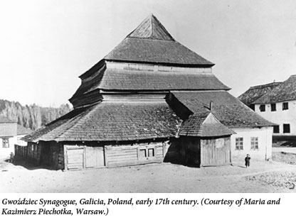 |  |
The synagogue was built somewhere between 1640 and 1700. Many public buildings, especially in the villages and countryside, were made of wood in the Poland of that era. In 1729, the roof was rebuilt and a towering cupola was added. The cupola reached its greatest height directly over the bimah. The building was small, 36 feet square. Outside, the roof reached much higher than 36 feet, but the cupola inside stopped at exactly 36 feet above the floor. Hubka speculates that the 36-foot cube defined by floor and cupola was meant to recall the cube of the Holy of Holies in the Temple.
Were the craftsmen who designed and built this new roof (and the old one, for that matter) Jews? Maybe yes; probably no. The answer is unimportant. The Gwoździec synagogue was shaped by the texture of Jewish time and the laws, customs, liturgy, and ceremonial functions of the synagogue. It was an embodiment of the Judaism of that time and place: molded by halakha and longstanding Ashkenazic custom; deeply influenced by the symbolism of the Zohar.
The artists who painted the remodeled synagogue, with its towering new cupola, were Jewish. They left stylized signatures inscribed in medallions that were integrated into the intricate design of the walls, one of which reads:
See all this was made by my hands [Isaiah 66:2], for the glory of the place and the glory of the community, the artist Isaac son of Rabbi Judah Leib haCohen from the holy community of Jarychow, in the year 1729.
“The visual intensity of the synagogue’s wall-paintings can be overwhelming,” writes Hubka, projecting himself into the past. The paintings included the text of Hebrew prayers and blessings in large, beautifully-made letters, and many animals: camels and elephants, turkeys and squirrels and lions, griffins and unicorns. Intricate foliage filled the gaps. Old color sketches of this synagogue (miraculously preserved) suggest that the paintings relied on a bright, brownish red and dark blue—the vivid colors of public ceremony. The Hebrew words are black on white.
In a fascinating discovery, Hubka notes that the North, South, and East walls respectively have images of a showbread table, a menorah, and Tablets of the Law—reflecting the position of these sacred objects in the desert Tabernacle. In effect, the painters put the congregation inside the Tabernacle.
Hubka’s discovery recalls Paul Binski’s reading of the poorly-preserved wall paintings in the chapter house at Westminster Abbey, where the monks met as a group. The medieval paintings, Binski found, reflect Isaiah’s vision of the Lord amidst the seraphim (celestial angels) and the Ark of the Covenant in the desert Tabernacle: “The monks of Westminster, as the Children of Israel, are gathered in the presence of God.”
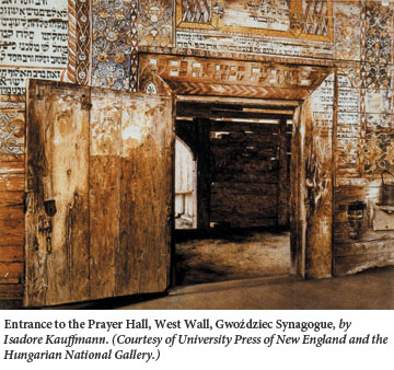
Another fascinating architectural feature Hubka discusses is a latticed window above the door on the west wall, opening on nothing—merely dark, unused attic space. Other Polish wooden synagogues have the same sort of latticed window in the same position. Why?
Hubka speculates that the latticed window became a standard fixture in the wooden synagogues of Poland during the period the new liturgy of Kabbalat Shabbat (Welcoming the Sabbath), a kabbalistic innovation of the 16th century, became an accepted part of the Friday evening service in Poland. As they finished singing the hymn Lecha Dodi, the congregants, then as now, would turn west to face the synagogue’s entrance and symbolically welcome the Shekhina (Divine Presence) as the Sabbath Bride. But in facing the door, the congregants also faced the latticed window—which evidently represented the Gate of Heaven mentioned by Jacob after his dream. This is described in the Zohar as a two-way gate through which Israel looks towards the Lord and the Lord looks hopefully (longingly?) back at Israel.
The latticed window of Gwoździec is an instance of the veil imagery that is so important to Judaism. The Lord is transcendent, wholly outside the human cosmos, yet He can be approached intimately. A Jew can go to the very brink of transcendent divinity—up to the veil that separates man and God. The veil symbol is embodied in many forms. The curtain (parokhet) before the Ark, the two curtains that screened the Holy of Holies, the veil Moses wore to hide the frightening luminance of his face after meeting God are all, I believe, instances of this symbol.
Hubka, who descends from Polish Catholics, writes meticulously, finely, sometimes lovingly about this remarkable synagogue. His text is illustrated throughout with beautifully clear and precise architectural drawings, which are also, it seems, his work. By careful research, by marshalling detail upon detail, he conjures this extraordinary building out of the ashes of Jewish Poland. His book is academic research at its noblest.
(Hubka’s work, together with that of other scholars, has inspired a group of artists and students at Handshouse Studio in Western Massachusetts to create a model of the Gwoździec synagogue and its interiors. You can see a slideshow of their beautiful work at the Handshouse website.)
The influence of Hebrew literature on western art was, of course, gigantic. But Jewish architecture is another story. Because its achievement is largely unknown, its influence has been virtually non-existent. Even when he was building a synagogue, Frank Lloyd Wright ignored it.
Historically, the external architecture of the synagogue never had a chance to develop its own proper shapes and gestures. Until the modern period and sometimes even later, anti-Jewish laws and customs limited the extent to which synagogues could outshine nearby churches and mosques. In the meantime, Jewish architecture was inward-looking. And the art of the synagogue interior, exemplified in Gwoździec and ignored in Wright’s Beth Sholom answers one of the hardest questions in western architecture: What goes under the dome?
The Dome Question has plagued architecture since the Pantheon in 2nd-century Rome—progenitor of nearly every centralized building of the West. These centralized buildings (often domed, usually with ground plans that are squares or regular polygons, always with a soaring roof) have always been exciting because they build (like a good story) to a climax. They create a thrill of anticipation as you approach. (What is that huge space going to be like inside?) They are lenses focusing the thought and anticipation of the surrounding populace onto a single point or shaft of space: the vertical shaft at the exact center of the building, the point at ground level beneath the dome.
And the outcome is nearly always frustrating. The whole building conspires to make you expect something important at the center, something extraordinary. But architects have rarely come up with anything to put there. Thus the domed building, one of architecture’s grandest gestures, is a thriller without a finish.
The Pantheon is prototypical: At the center under the open sun—window or oculus on top is—nothing. Empty floor. Beneath the soaring octagon over the crossing at Ely Cathedral: again, nothing. Beneath the central dome of San Marco in Venice: once more, nothing. The same holds for Brunelleschi’s epochal dome at the cathedral of Florence and Bramante’s tiny but gigantically influential Tempietto in Rome; at the Salute, the baroque masterpiece at the head of the Grand Canal in Venice; at St. Paul’s in London, the Pantheon in Paris, and the Capitol Dome in Washington. At dead center, nothing.
There is one species of exception. Some churches follow the example of St. Peter’s in the Vatican and put the altar beneath the dome. But this response to the great Dome Question is a half-answer at best. The altar is a sacred zone where priests officiate and laymen are out of place. Bernini’s great canopy over the altar at St. Peter’s is awe-inspiring, not inviting. It says “Keep your distance! Stand back!”
The traditional synagogue has a very different solution. It puts the bimah at the center, reflecting the fact that the congregation is part of any public Torah reading. Representative priests, Levites, and plain Jewish citizens join the Torah reader and linger. The congregation surrounds the bimah; congregants who are helping or merely listening stand nearby. Often they surround the table on all sides. The surge of the crowd reaches right to the center of the building, and at the exact center is the unrolled Torah scroll itself. In a synagogue with a soaring roof and a central bimah, the story has a climax after all. The unfinished cadence resolves.
In a crowded synagogue (especially a large one) with its bimah at the center, you sit or stand amidst a powerful, inward-surging tide of attention and emotion. My wife and I happened to spend a recent Rosh Hashanah in Frankfurt. To our surprise, the large synagogue was mobbed. The movement of human energy towards the center of that huge, tall room was vivid and palpable and unforgettable.
The unique power of synagogue architecture is human-scaled. The building responds to its users. The finest synagogues stand with the very best achievements of western architecture. Their great art is deep instead of dazzling—unlike Wright’s brilliant Beth Sholom, just like the lost and (now) recovered shul of Gwoździec, they come alive when they are filled with people.
The two synagogues have a surprising relation: Wright’s sprawling, towering, wholly distinctive celebration of suburban Judaism echoes the shape of that small, long-ago building in Poland. And the echo tells us something important about the remarkable and largely unknown achievement of synagogue architecture over the centuries.
Suggested Reading
Nothing but Blue Skies
Irving Berlin was generating Tin Pan Alley hits before Ronald Reagan was born and was still writing lyrics when the elderly Reagan occupied the White House.

The Jewsraeli Century
Ben-Gurion declared that “with the creation of the state, we are standing on the edge of a new era. Not only in the life of the Jewish community in Israel, but . . . in the history of Judaism itself.” He was right, but not in the way he thought he would be.
Necessary Power: A Rejoinder to Jonathan Sacks
When Rabbi Sacks writes, “It is not our task” (and it was not Abraham’s task) “to conquer or convert the world or to enforce uniformity of belief. It is our task to be a blessing to the world. The use of religion for political ends is not righteousness but idolatry,” it seems to me that he oversimplifies matters.
18 Questions with Jeremy Dauber: The Purim Edition
Who ruled the Borscht Belt: Allan Sherman or Lenny Bruce? Jewish comedy expert Jeremy Dauber casts his vote in a humorous interview—just in time for Purim.
Comments
You must log in to comment Log In